A bit about me
I'm a Fine Artist and Printmaker with a particular interest in drawing and printmaking.
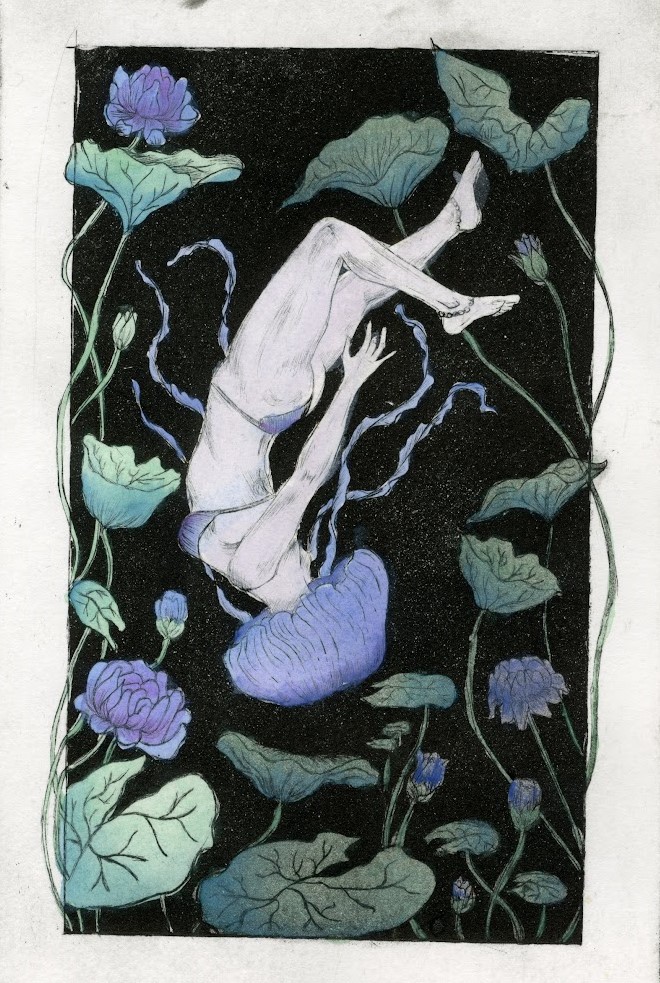
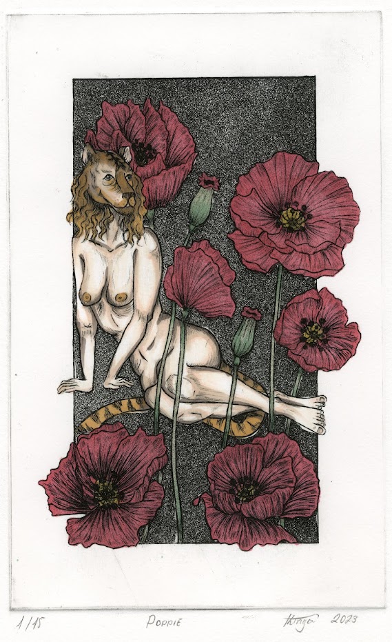
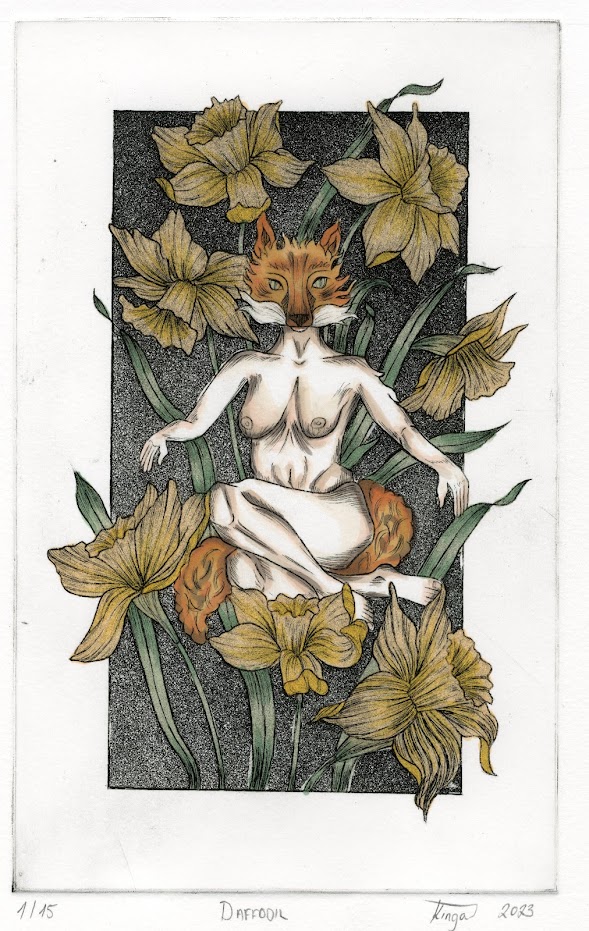
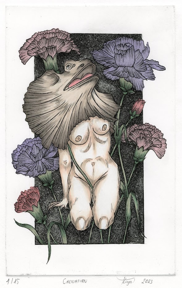
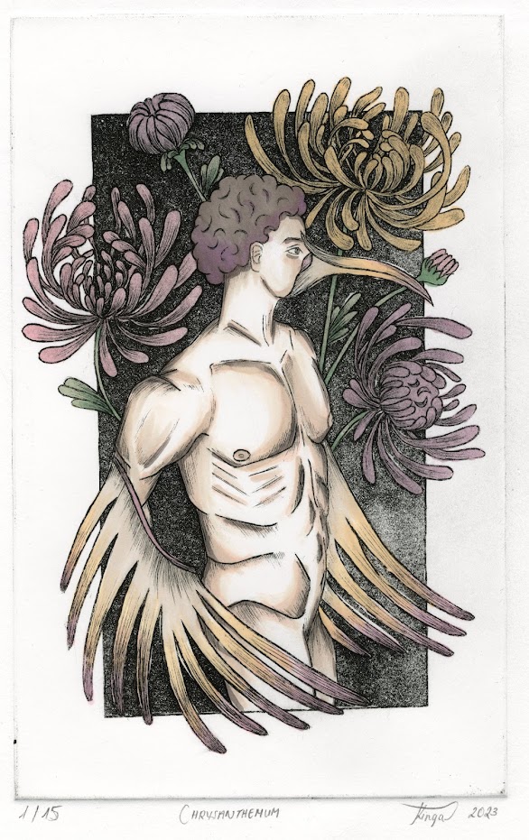
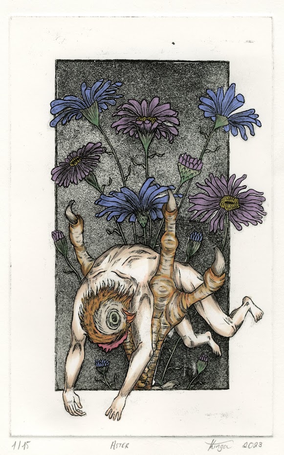
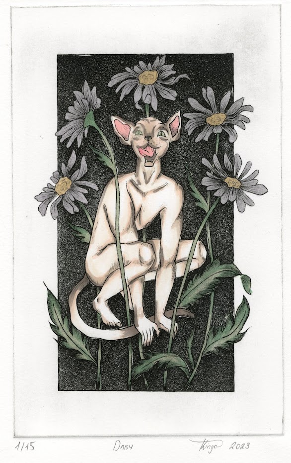
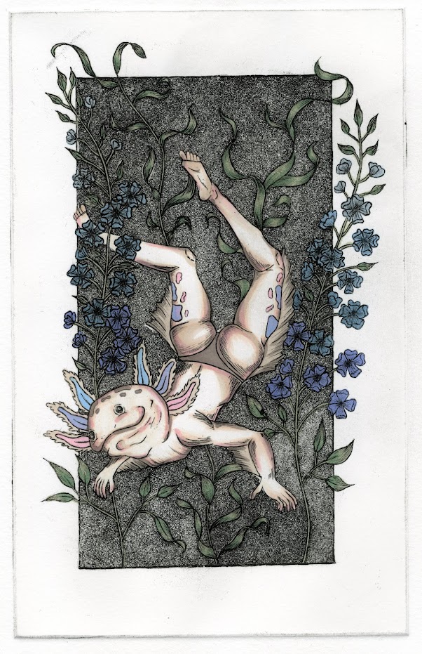
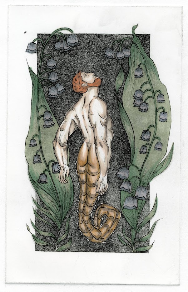
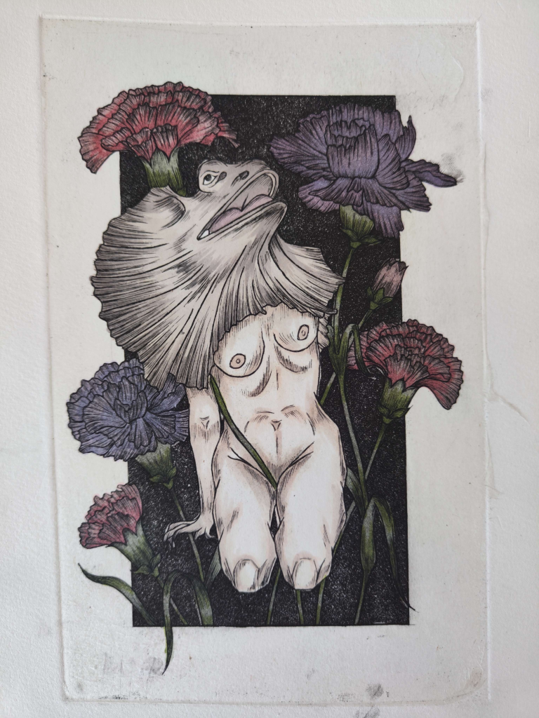
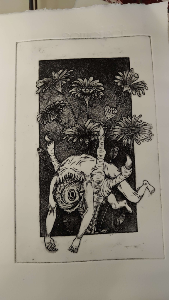
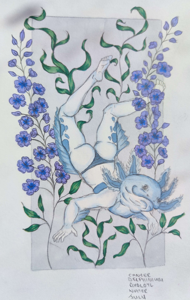
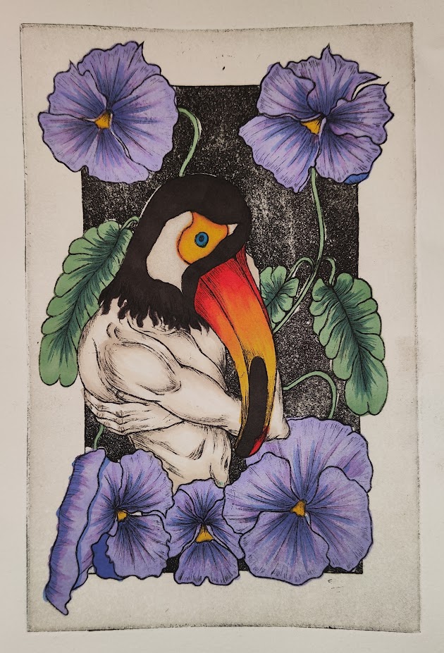
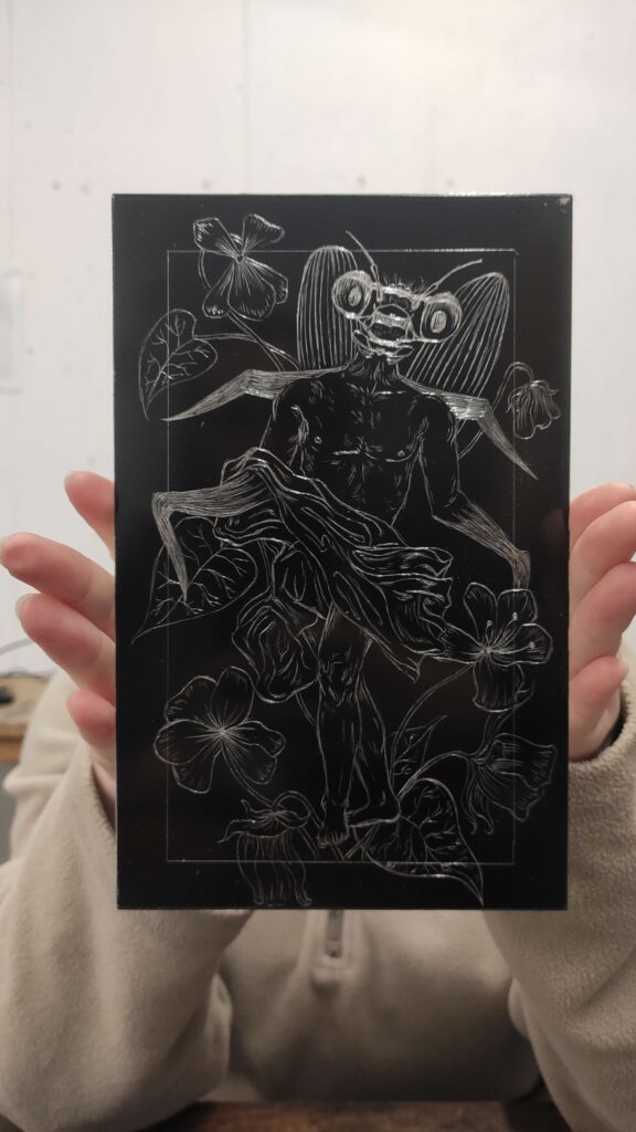
Through a carefully coordinated fusion of human forms inspired by Greek classical figures and animals representative of the zodiac's elemental signs, I craft extraordinary beings encircled by the flowers associated with each birth month. By employing the technique of etching, I am able to produce images that are not only striking in appearance but also have unexpected effects resulting from the time-consuming nature of the process. To lend a delicate and exclusive quality to the prints, they are carefully hand-coloured using alcohol markers and watercolour paints, complimenting not only my art style but also the process.
WEEK 16
At this point, I have ensured that all my prints are ready for printing and I began to think about colour and editions. I have decided to print two editions for each of my plates. The first edition would be hand coloured with alcohol markers and the second edition would be black and white with chine colle in order to make the print stand out. For the chine colle, I used gampi paper, which has an off-white colour. When printing with the paper on top, the ink appears to be more vibrant and more punchy. The slight contrast between the pure white paper and the print itself makes the image more pleasing to look at. At first, working with gampi was very challenging as it is a very delicate paper. It would rip multiple times when working with it, whether it was in water or when printing. I also had to ensure that the paper for printing was not too dry or too damp and that the gampi was treated with the right amout of photo mount. After multiple attempts to get it right, I have managed to print using the technique to a presentable standard. The only thing left to do, was to cut off any pieces of gampi that were too big.
WEEK 15
In the past multiple weeks, I have been busy with completing my curating exhibition assignments as well as ensuring that my plates are ready to print. In order to fully remove the ground from my plates, I have rubbed them with some brasso and the degreased them, so that there would not be any finger print marks visible. I also stocked up with Somerset paper, which I have decided to cut into A3 pieces for my exhibition prints. I figured that a smaller print on a larger piece of paper will make it more visually appealing. It almost makes the print appear more important and official.
WEEK 14
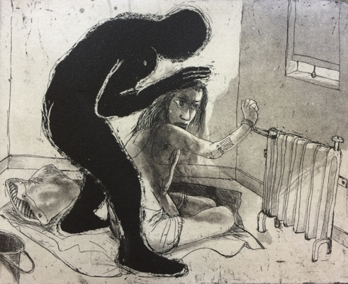
This week, in order to prepare for my assignment for my Curating Exhibition module, I have prepared a proposal template for the layout of the exhibition pieces by Marcelle Hanselaar. I tried to place the works next to each other based on familiar themes running throughout the prints. This allowed me to envision the exhibition space and therefore, writing the labels was much easier than before. I have not spent a lot of time on my printing due to this, as the curation module is very demanding and very hands on. Analysing exhibition spaces and the labels has really allowed me to further envision my space for the graduation exhibition in May. Thinking about the size of my prints and the way they would present themselves has allowed me to begin thinking about how I would like to print my illustrations.
WEEK 13
I have spent this week working on two plates at the same time. It was quite a lot of work, especially with the aquatint and step etching, but I believe that the results are very promising. I have managed to get the hang of aquatint in order to make it fairly even as well as uniform across all my prints. I have also worked out set etching times for each stage of my print. The printing also went very smoothly, the only downside was that the edges of my prints still print black. I will have to work on the way that I prepare them to ensure that this doesn’t happen again.
WEEK 12
Starting the second semester of the third year, I was already prepared with a couple of plates and have successfully been able to print my first one in the first week back. I unfortunately had to change the composition slightly by removing some of the image in order for the figure to appear to be coming out of the frame. After discussing this with my tutor, we decided that the change worked compositionally a lot more than my initial version. Although I have made this alteration, I am satisfied with the slowly improving quality of my prints. I still need to ensure that my lines are the best they can be, as some of them came out slightly too chunky when printing. This week I have also had my first class on curating an exhibition. I hope I will learn a lot of new skills, especially that this will be a very practical module.
WEEK 11
After successfully submitting my presentation and digital portfolio in the past week, I was now able to focus on my exhibition work for this semester. After completing a plan for all of my prints, I started creating sketches for them, so that I could easily transfer them onto my plates and start printing straight away when my classes began again. Since I found that I was struggling to draw my designs onto my plates after sketching them out last semester, I decided to make it easier for me. I found that drawing over my sketches on tissue paper, and then over the tissue paper onto a plate prepared with hard ground left me with very faint lines on my plates. I used this as a way to guide my hand when drawing. This not only sped up the process of preparing my plates for printing, but also helped me with the accuracy of my drawing.
WEEK 10
Over the Christmas holidays, I have been working on my Digital portfolio for my first semester of third year. On top of that, I had to prepare a presentation in which I had to talk about my graduation exhibition project and my further intentions in the second semester of the year. This took up most of my time as I had to ensure that the presentation not only looked presentable, but I also had to record a voice-over, as if I was presenting it in person. That was a challenging process as I have stuttered multiple times and had to record the same message over and over. It did not help that I had to ensure that my family was not heard in the background. The recordings had to be clear. Powerpoint also is not the best programme to record in as it often refused to record. That was very frustrating.
WEEK 9
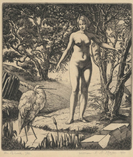
After finishing my printing for the semester, I had to put together my submission portfolio. This allowed me to once again loot at the artists who have influenced my work and inspired me to create it in the very beginning. Most of my artist influences are from second year so I didn’t do much research around them before beginning my work as I was already quite aware of them already. However, before finishing for the Christmas break I visited the School of Art collections in order to draw more inspiration and hopefully to further improve my work. One of the artists that have particularly caught my attention was William Evan Charles Morgan. Morgan’s work has been a notable influence on my artistic practice, particularly his approach to figure drawing. Despite drawing inspiration from German engravers, the figures in his prints evoke a certain Greek aesthetic, characterized by attention to the curvature of the body. This emphasis on form has greatly impacted my own approach to figure drawing and composition. Specifically, I have incorporated Morgan’s techniques into my work by arranging flowers around my figures in a similar manner, creating a sense of balance and harmony. I have borrowed also his approach to tone, utilizing a range of shades to create depth and dimensionality in my prints. As a result, I found my research to be very effective.
WEEK 8
At this point I have completed my plates, ready for printing. With many prints ready for colouring, I began experimenting with watercolour paints and different shades and colours in order to bring out the best features of my prints. Unfortunately, I found that watercolour paints make the prints look dull. Instead, alcohol markers provided much better coverage with much more consistent outcomes, event enhancing my prints. I was able to use much brighter and saturated colour, which made my images look of higher quality. However, the only downside of this was that I had a limited amount of colours, which sometimes overpowered my prints. I would like to use less saturated colours, more pastels. This would allow the colour to compliment my image, not take over it. After comparing my coloured prints, I decided to also try an overlay of off-white colour over my prints, in order to make them stand out on the paper more. I found that this compliments my colours and makes them look more delicate, as opposed to when the prints were printed on pure white paper.
WEEK 7
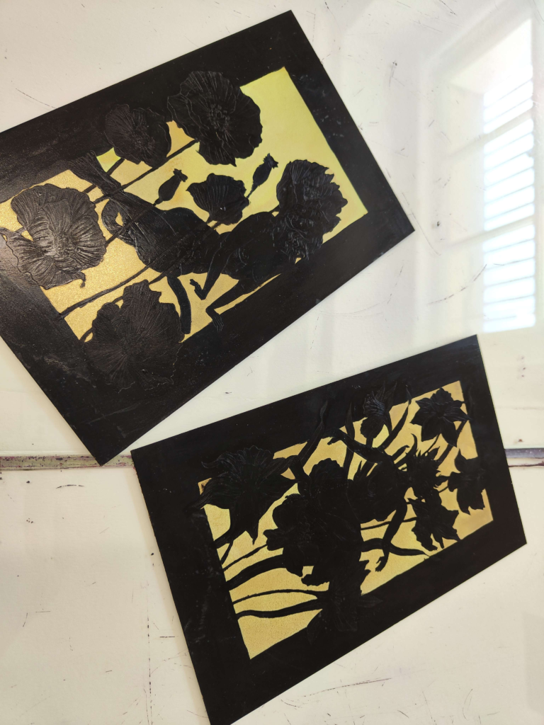
After successful prints using copper and brass plates, I decided to use up the rest of my clear copper one’s and then continue to produce my prints on brass. Brass is much cheaper and working with it takes less time than with copper. As I got more comfortable with using the metal, my prints have greatly improved and I was able to focus better on my compositions as well as the lines I made. At this point my illustrations were also more coherent with the theme I have set for myself and ideas for my future illustrations have come to mind more confidently. This week I have mainly spent on finishing my plates for printing and printing multiple version, so that I could experiment with colours.
WEEK 6
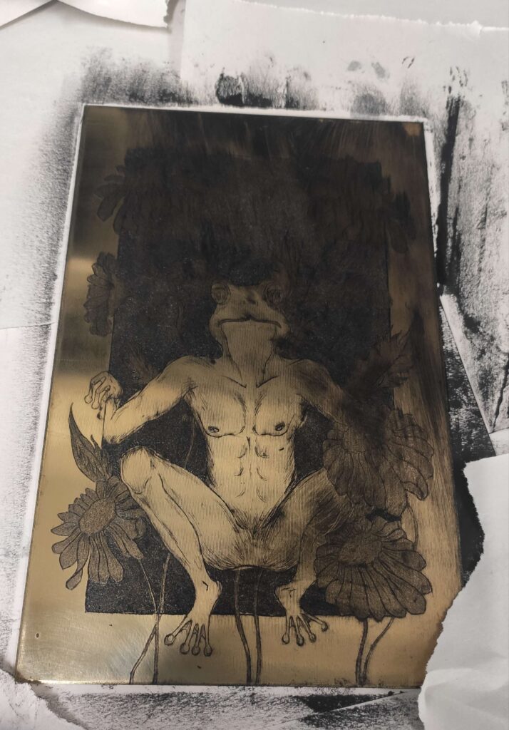
Even though I feel comfortable when working on copper, I also had the opportunity to try printing on brass. Brass is a new metal in the printing department as it hasn’t been used due to its texture. Upon closer inspection, it is evident that the metal has thin lines going across it. Because of this, it has been avoided. However, after some experimentation with the metal, I found that the lines do not show up at all when printing and the metal has characteristics very similar to copper. As a result, it is not only cheaper, but also etches much quicker than copper. I was very pleased with the outcome when printing with brass, although, wiping the ink back has been a bit troublesome because of the lines. However, as long as it is wiped properly, it poses no troubles.
WEEK 5
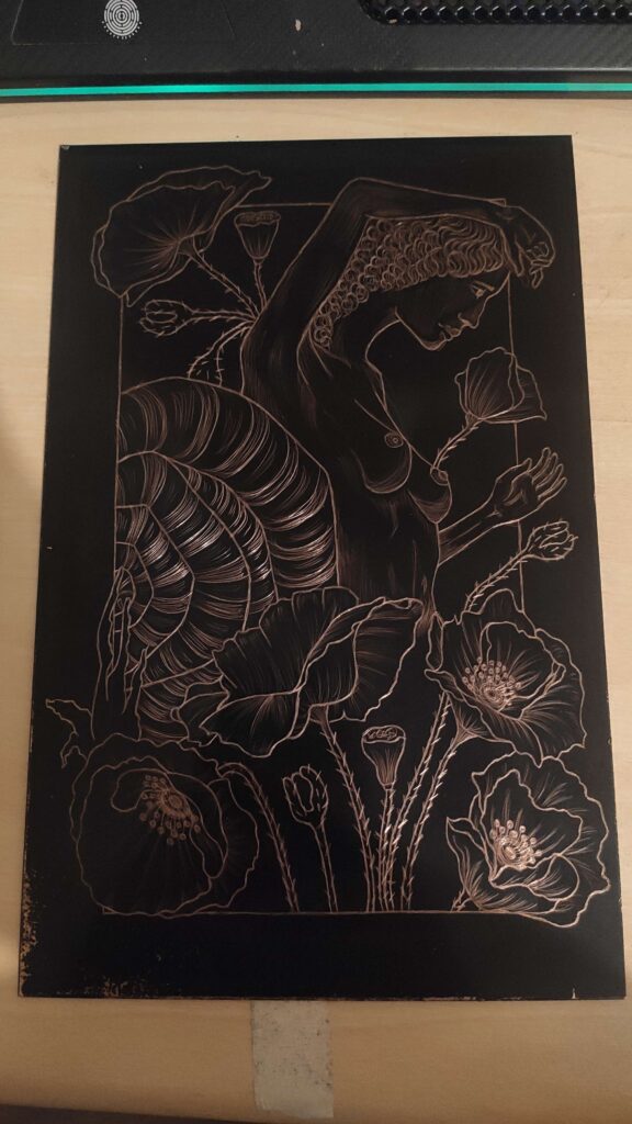
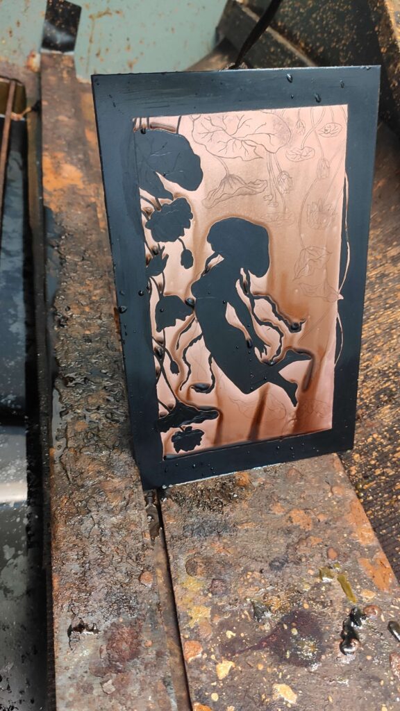
After multiple failed attempts with the aluminium plate, I decided to start working on copper, as it is much softer to work with, hence producing more delicate and clear lines. Drawing on copper also let me 'shade’ using lines easier, as I was able to effortlessly change my line weight. When etching copper, I learnt that the etching times are much shorter, therefore 30 minutes in total would produce very deep blacks. At first, when printing the linework, I decided to step etch this print in order to make the flowers in the background slightly darker, so that the figure stands out more. In the process, I forgot about this, and accidently stopped out half of the flowers, but I liked the outcome in the end. I also decided to black out the background of the figure and leave a white border. Unlike with aluminium, I couldn’t just step etch the plate. Etched copper doesn’t have a rough surface like aluminium does, so I had to use aquatint in order to achieve the same effect.
WEEK 4
After printing last week, I discussed adding colour to my prints with my tutor, who recommended creating another plate, which would be printed directly on top of my initial plate. In order to ensure that the shapes and lines are the same, I bought another aluminium plate which was exactly the same size as my first one. I then inked my plate, printed it on paper and then put my de-greased aluminium plate in the same place as the etched plate. I put the paper back onto the plate and ran it through the printing press again. As a result, I was left with a stencil of my print which I baked for a minute in order to set it. When the plate has cooled down and the ink was set I painted coffee on the areas where I wanted to print colour and then I once again, baked my plate to set the liquid. In order to be able to etch those areas, I had to roll a thin layer of ground onto the plate. When plate was ready to etch, I put it into the solution for about 30 minutes, cleaning off the rust from the etch every about 5 minutes. After taking off the ground, I printed the plate using the same technique as double-drop, however, I couldn’t line it up with the print, some of the etching was off. I tried to correct it using spit-bite, however, the etching process was very tedious and took a long time. The colour mixing wasn’t also very successful as the results came out looking fairly flat and the colours were too dark.
WEEK 3
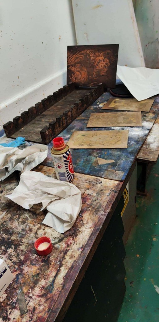
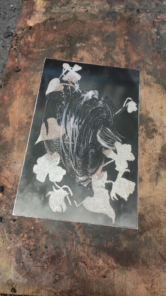
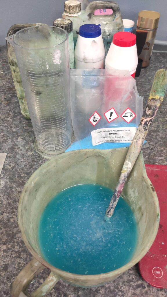
Once I had finished preparing my plate for etching I had to remind myself how to etch again, as I haven’t done it in a long time. Every metal has a different etching solution, which has to be mixed in a certain way in order to produce the desired effect. The mixing was simple and I have decided to step etch my plate in a way, so that the figure has darker lines than the flowers behind it in order to make it stand out a bit more. I was advised to etch the plate for a total of 10 minutes for my desired result, therefore I etched the plate for 4 minutes initially. Then, using stop-out (ground mixed with lavender oil), I painted over the flowers and baked the plate to set the mixture in order to etch the figure for longer. After etching for further 6 minutes, I removed the ground with a paint stripper and printed the plate. In order to make sure that the prints are good, I printed multiple at the beginning to ensure that my wiping wasn’t too harsh. From the prints, I decided that I wasn’t a fan of the fainter flowers, therefore, I will not be doing that next time.
WEEK 2
This week I created some initial sketches without any strong ideas on what I wanted to print. After discussing my ideas in a tutorial, they became much clearer and my line of focus narrowed. From the tutorial, I have decided that my prints will display an animal and human hybrid surrounded by flowers. Due to my detailed nature of sketches, intaglio seemed to be a much better fit for my work, rather than relief printing. I started off by buying multiple scraps of metal plates in order to figure out which metal is the best for my work style. Zinc tends to distort some colours when printing, hence, I decided not to work with it as I wanted to add colour to m prints. Therefore, aluminium became my first target. It is cheaper than other metals and due to its nature, it etches with a rough surface, which means that aquatint is not needed in order to create different tones on larger areas of the plate.
WEEK 1
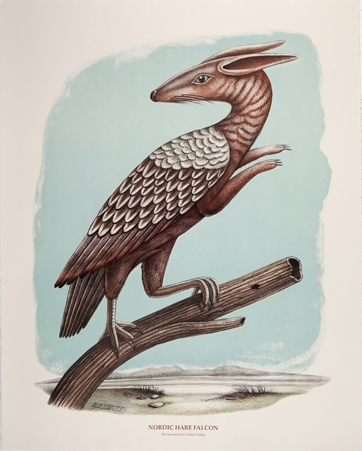
During the first week, I had a group talk about projects and initial ideas as well as talks about work from previous year. When printmaking in second year, I produces many different prints which featured animal hybrids, therefore, this sparked the idea of further producing unique work, which has some sort of hybrid. My initial thought was to continue drawing human figures, as I greatly enjoyed doing that during my life drawing classes, and combining them with flowers. However, I also wanted to continue drawing animals, like I did during printmaking. It was hard for me to implement all of these into a single image, so I was also considering combining human bodies with animals. Either way, one element of interest was missing. As a way of sparking more ideas, I was suggested to look at artists such as Beauvais Lyons and Hieronymus Bosch. Both artists produced very unique work which includes at least one of my interests. Even though their work differs greatly from my style, it helped me to come up with clearer ideas and I ended up leaning more towards combining human figures with animals, rather than flowers. This meant that the flowers would instead of being combined with a body, will be surrounding it in the background instead. Finally, this sparked the question of which printmaking technique I would be adapting for my work. Since I didn’t learn screen printing and lithograph, I didn’t want to add to much additional work and decided to work with either relief printing or intaglio, but I would decide for certain after creating some initial sketches.
